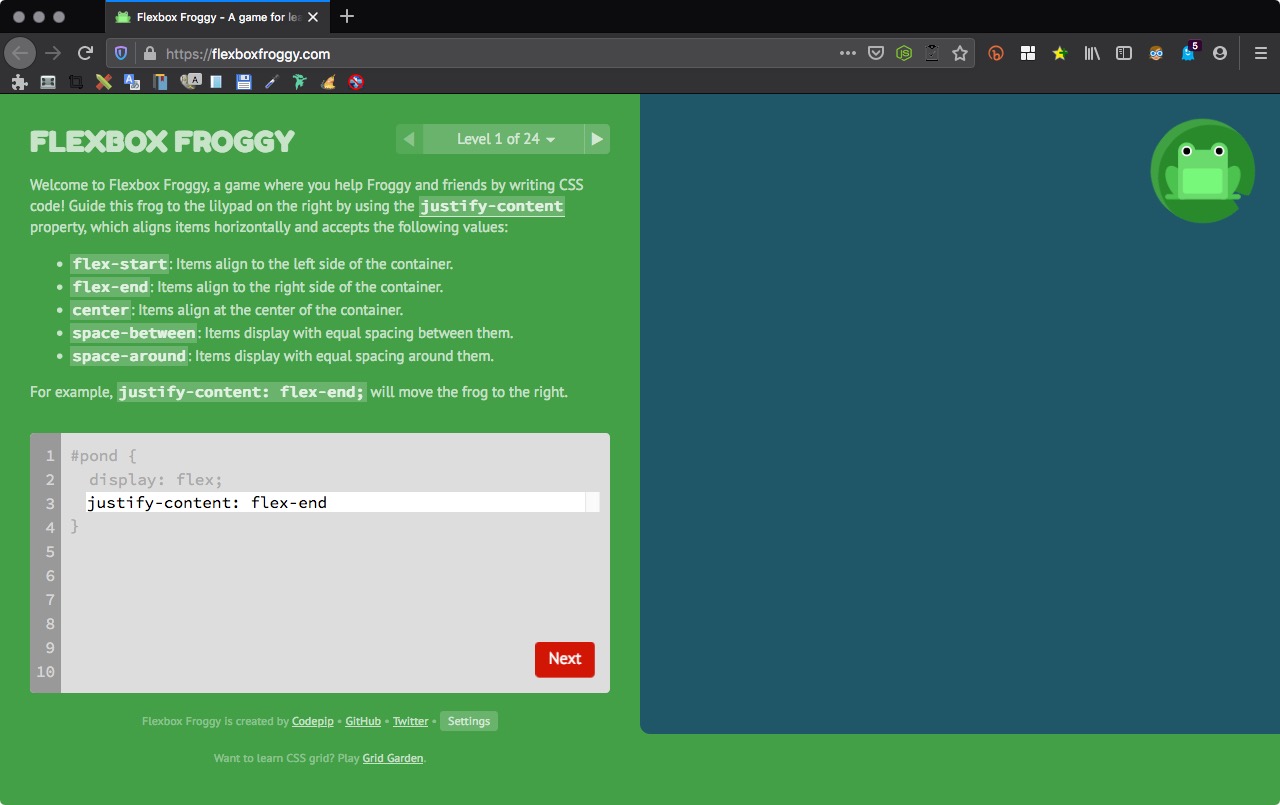
Level 1 of 24
Welcome to Flexbox Froggy, a game where you help Froggy and friends by writing CSS code! Guide this frog to the lilypad on the right by using the justify-content property, which aligns items horizontally and accepts the following values:
flex-start: Items align to the left side of the container.
flex-end: Items align to the right side of the container.
center: Items align at the center of the container.
space-between: Items display with equal spacing between them.
space-around: Items display with equal spacing around them.
For example, justify-content: flex-end; will move the frog to the right.
1 | justify-content: flex-end |
Level 2 of 24
Use justify-content again to help these frogs get to their lilypads. Remember that this CSS property aligns items horizontally and accepts the following values:
flex-start: Items align to the left side of the container.
flex-end: Items align to the right side of the container.
center: Items align at the center of the container.
space-between: Items display with equal spacing between them.
space-around: Items display with equal spacing around them.

1 | justify-content: center |
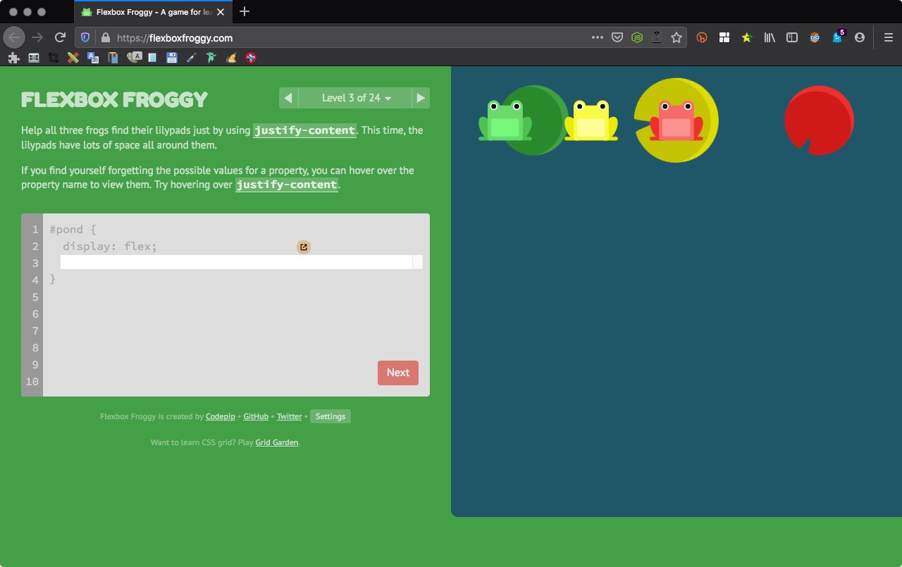
Level 3 of 24
Help all three frogs find their lilypads just by using justify-content. This time, the lilypads have lots of space all around them.
If you find yourself forgetting the possible values for a property, you can hover over the property name to view them. Try hovering over justify-content.
1 | justify-content:space-around |
Level 4 of 24
Now the lilypads on the edges have drifted to the shore, increasing the space between them. Use justify-content. This time, the lilypads have equal spacing between them.

1 | justify-content:space-between |
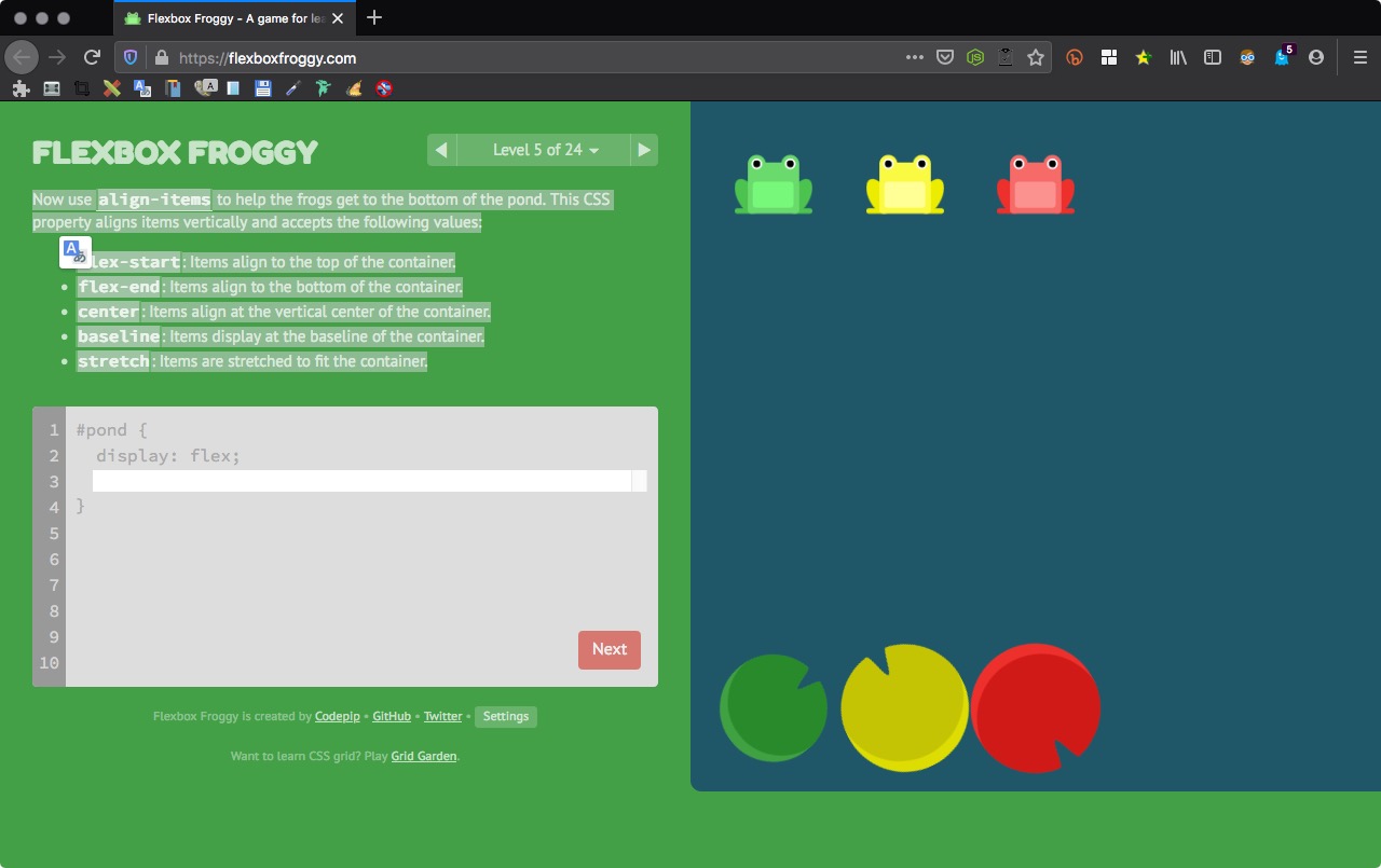
Level 5 of 24
Now use align-items to help the frogs get to the bottom of the pond. This CSS property aligns items vertically and accepts the following values:
flex-start: Items align to the top of the container.
flex-end: Items align to the bottom of the container.
center: Items align at the vertical center of the container.
baseline: Items display at the baseline of the container.
stretch: Items are stretched to fit the container.
1 | align-items:flex-end |
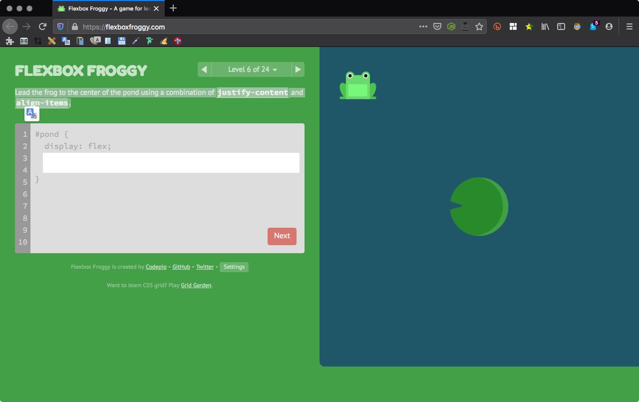
Level 6 of 24
Lead the frog to the center of the pond using a combination of justify-content and align-items.
1 2 | align-items:center; justify-content:center; |
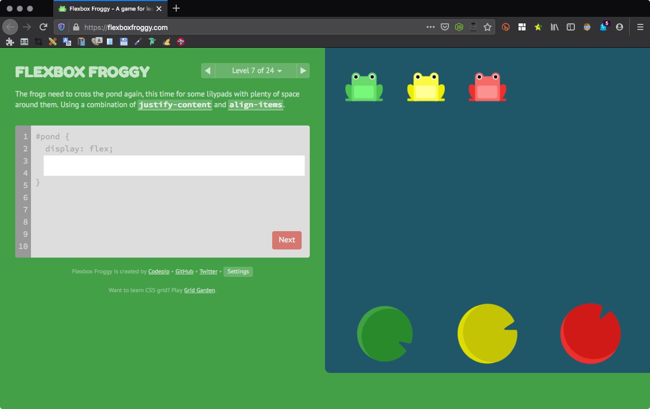
Level 7 of 24
The frogs need to cross the pond again, this time for some lilypads with plenty of space around them. Using a combination of justify-content and align-items.
1 2 | align-items:flex-end; justify-content:space-around; |
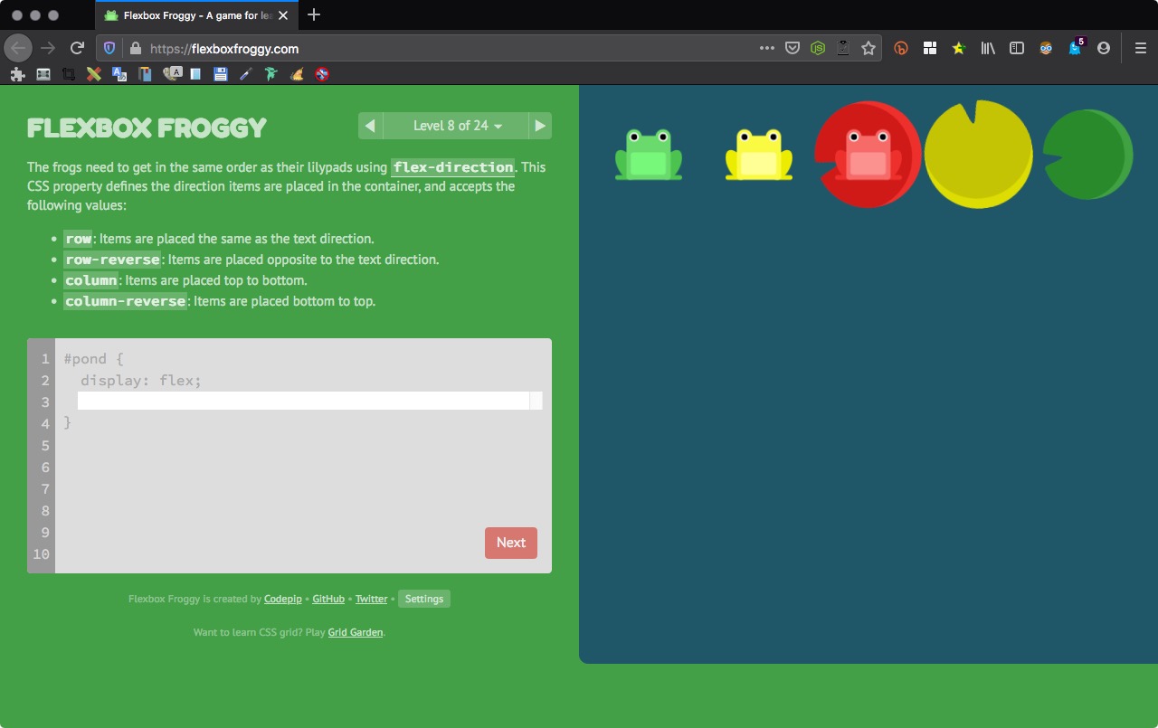
Level 8 of 24
The frogs need to get in the same order as their lilypads using flex-direction. This CSS property defines the direction items are placed in the container, and accepts the following values:
row: Items are placed the same as the text direction.
row-reverse: Items are placed opposite to the text direction.
column: Items are placed top to bottom.
column-reverse: Items are placed bottom to top.
1 | flex-direction:row-reverse; |
Level 9 of 24
Help the frogs find their column of lilypads using flex-direction. This CSS property defines the direction items are placed in the container, and accepts the following values:
row: Items are placed the same as the text direction.
row-reverse: Items are placed opposite to the text direction.
column: Items are placed top to bottom.
column-reverse: Items are placed bottom to top.

1 | flex-direction:column; |
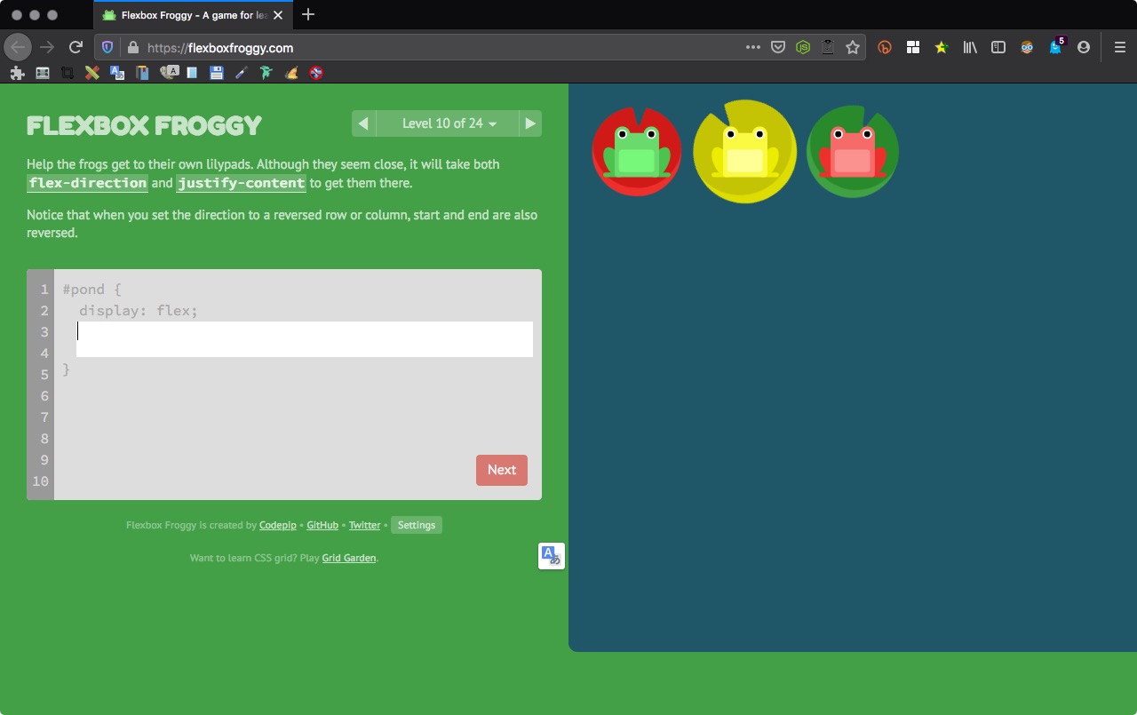
Level 10 of 24
Help the frogs get to their own lilypads. Although they seem close, it will take both flex-direction and justify-content to get them there.
Notice that when you set the direction to a reversed row or column, start and end are also reversed.
1 2 | flex-direction: row-reverse; justify-content: flex-end; |
注意色彩與軸線,軸線方向水平對應的是 row 與 row-reverse 的二個屬性。
Level 11 of 24
Help the frogs find their lilypads using flex-direction and justify-content.
Notice that when the flex direction is a column, justify-content changes to the vertical and align-items to the horizontal.

1 2 | flex-direction:column; justify-content: flex-end; |
Level 12 of 24
Help the frogs find their lilypads using flex-direction and justify-content.
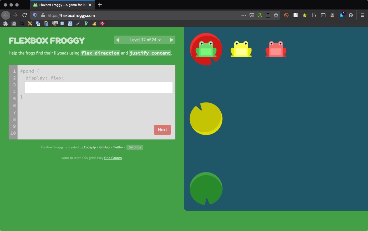
1 2 | flex-direction:column-reverse; justify-content:space-between; |
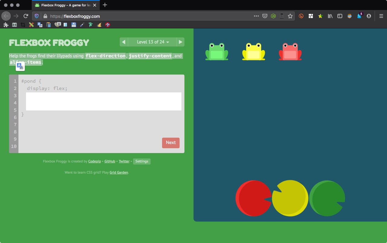
Level 13 of 24
Help the frogs find their lilypads using flex-direction, justify-content, and align-items.
1 2 3 | flex-direction:row-reverse; justify-content:center; align-items:flex-end; |
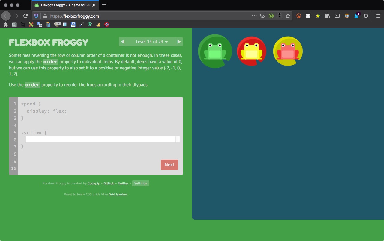
Level 14 of 24
Sometimes reversing the row or column order of a container is not enough. In these cases, we can apply the order property to individual items. By default, items have a value of 0, but we can use this property to also set it to a positive or negative integer value (-2, -1, 0, 1, 2).
Use the order property to reorder the frogs according to their lilypads.
1 | order:1; |
- order 定義元素的排列位置,有下 order 正值會排序到沒下 order 屬性的元素後方。
- 元素下到 order 負值,像是 -1 會被排到最前面。
- 如果有正負數值的 order 的話,沒下到 order 的元素會在中間。
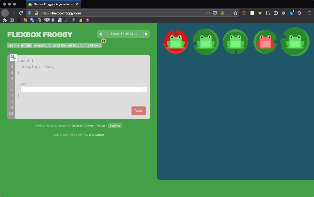
Level 15 of 24
Use the order property to send the red frog to his lilypad.
1 | order:-1; |
Level 16 of 24
Another property you can apply to individual items is align-self. This property accepts the same values as align-items and its value for the specific item.

1 | align-self: flex-end; |
Level 17 of 24
Combine order with align-self to help the frogs to their destinations.

1 2 | order:1; align-self:flex-end; |
Level 18 of 24
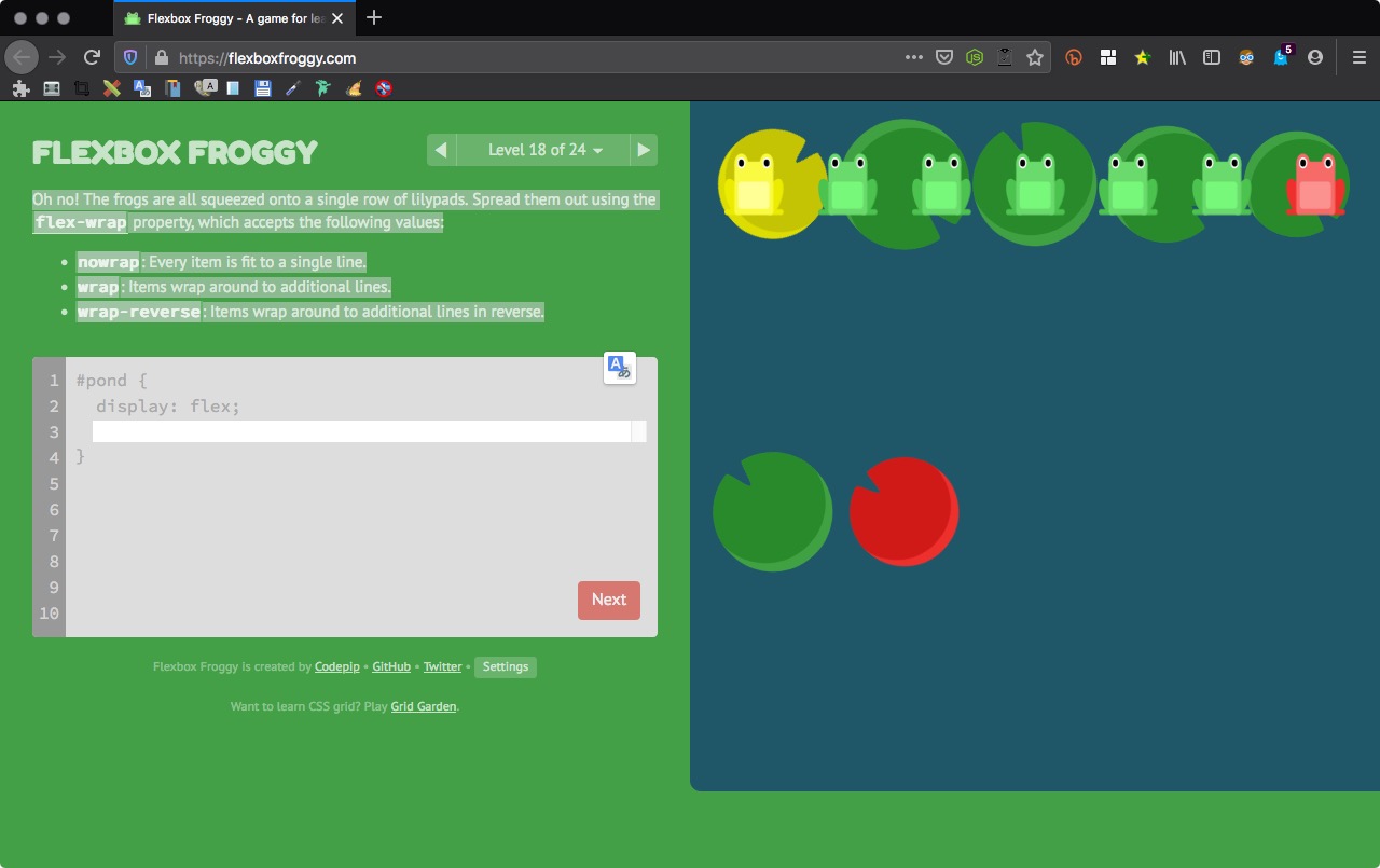
Oh no! The frogs are all squeezed onto a single row of lilypads. Spread them out using the flex-wrap property, which accepts the following values:
nowrap: Every item is fit to a single line.
wrap: Items wrap around to additional lines.
wrap-reverse: Items wrap around to additional lines in reverse.
1 | flex-wrap:wrap; |
Level 19 of 24
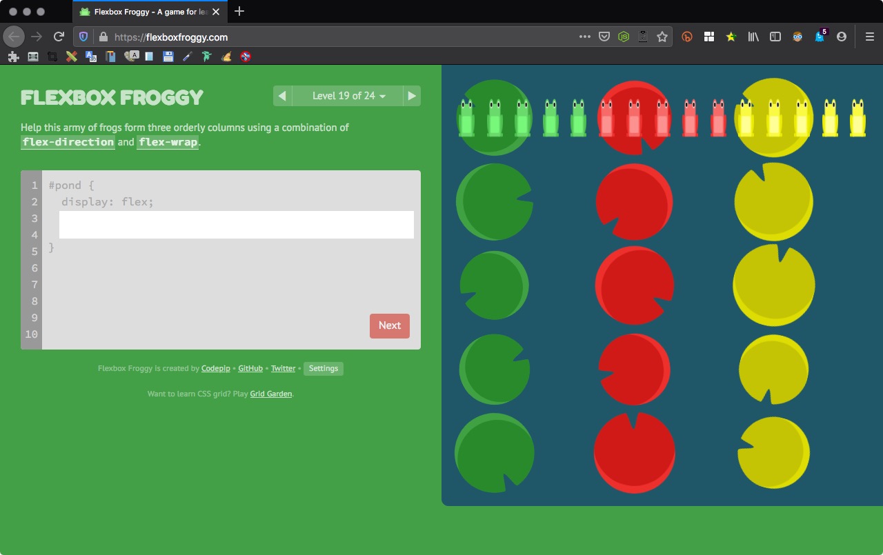
Help this army of frogs form three orderly columns using a combination of flex-direction and flex-wrap.
1 2 | flex-direction:column; flex-wrap:wrap; |
Level 20 of 24
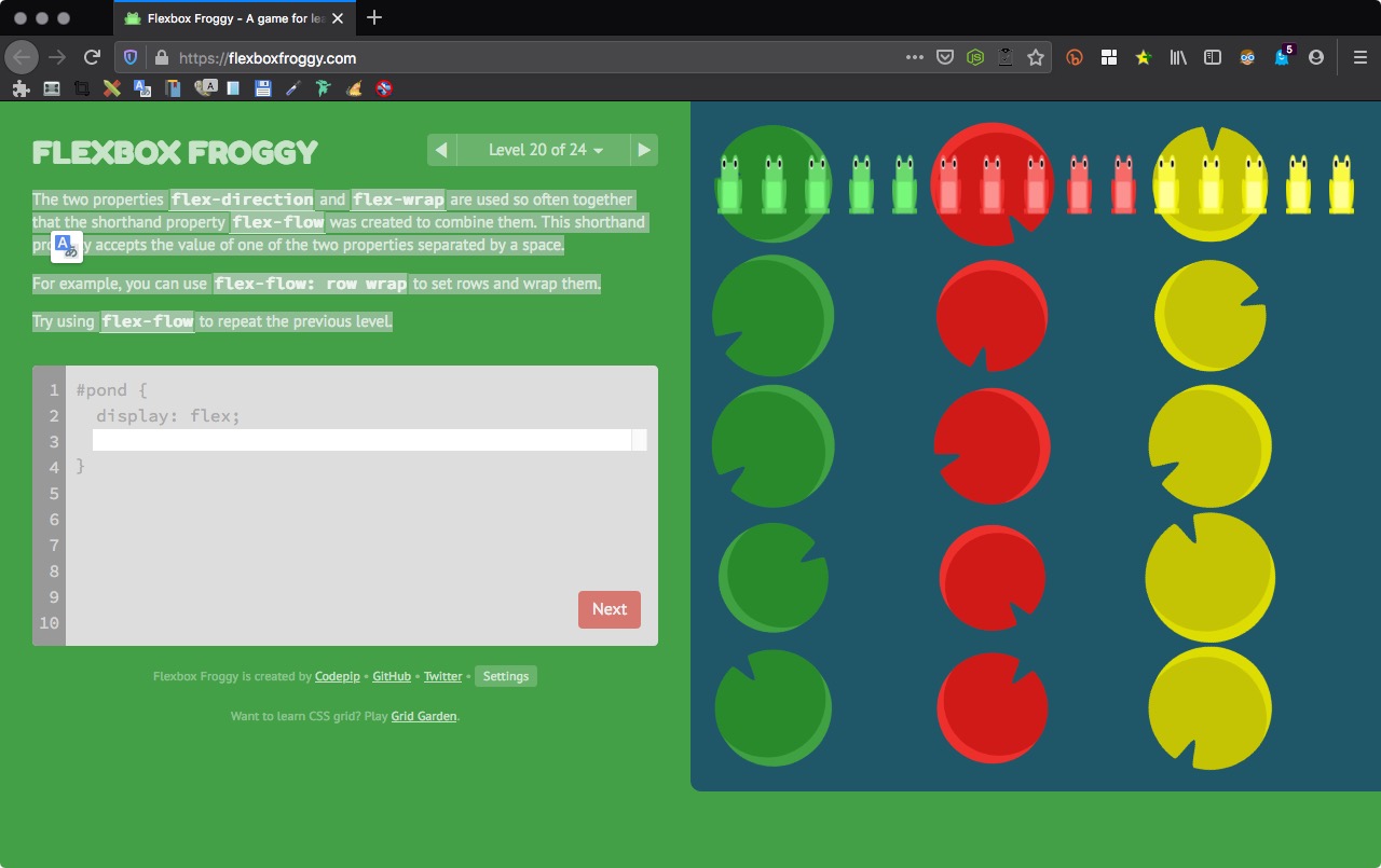
The two properties flex-direction and flex-wrap are used so often together that the shorthand property flex-flow was created to combine them. This shorthand property accepts the value of one of the two properties separated by a space.
For example, you can use flex-flow: row wrap to set rows and wrap them.
Try using flex-flow to repeat the previous level.
1 | flex-flow: column wrap; |
flex-flow 參數設定。
flex-flow: [flew-direction] [flex-wrap]
Level 21 of 24
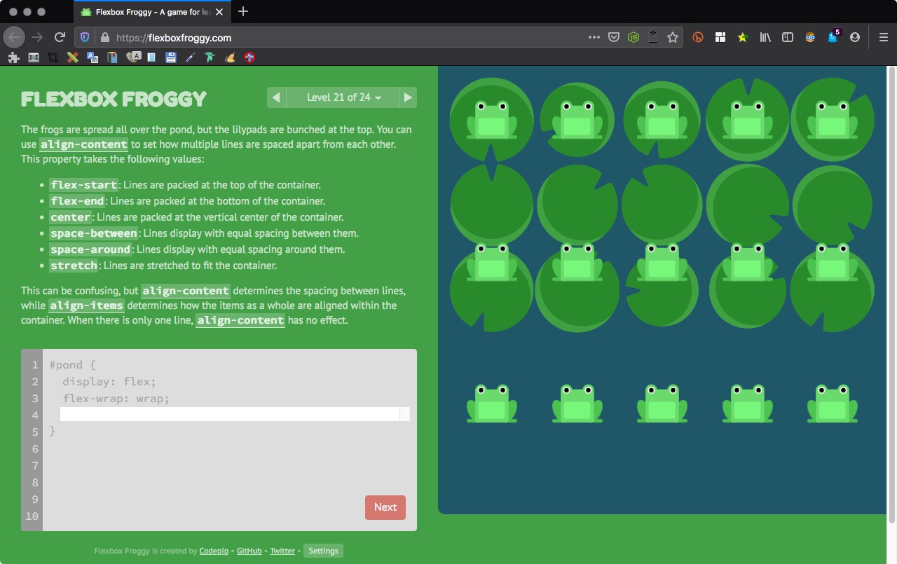
The frogs are spread all over the pond, but the lilypads are bunched at the top. You can use align-content to set how multiple lines are spaced apart from each other. This property takes the following values:
flex-start: Lines are packed at the top of the container.
flex-end: Lines are packed at the bottom of the container.
center: Lines are packed at the vertical center of the container.
space-between: Lines display with equal spacing between them.
space-around: Lines display with equal spacing around them.
stretch: Lines are stretched to fit the container.
This can be confusing, but align-content determines the spacing between lines, while align-items determines how the items as a whole are aligned within the container. When there is only one line, align-content has no effect.
1 | align-content: flex-start; |
Level 22 of 24
Now the current has bunched the lilypads at the bottom. Use align-content to guide the frogs there.
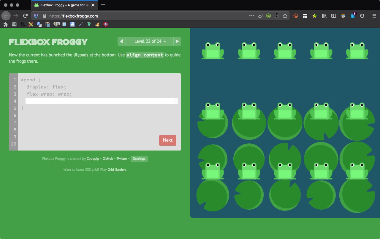
1 | align-content: flex-end; |
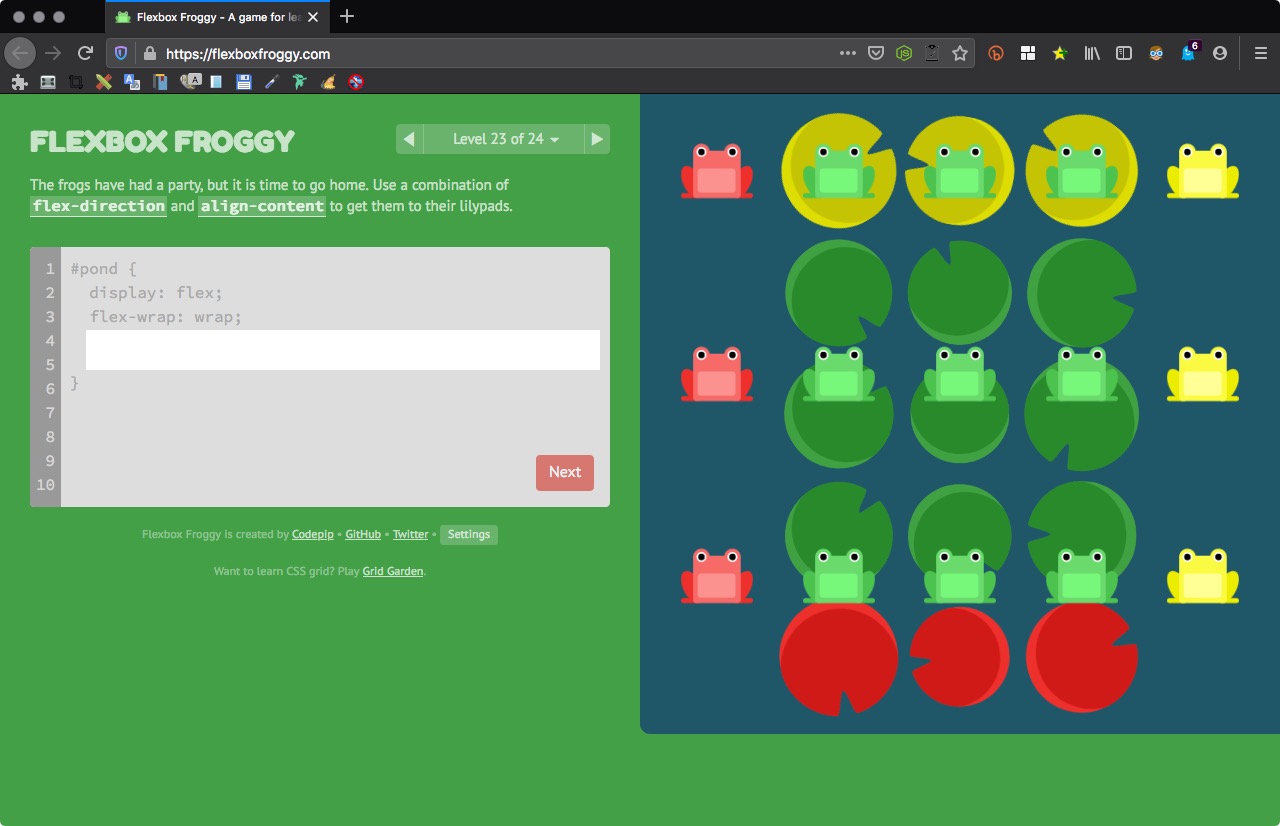
Level 23 of 24
The frogs have had a party, but it is time to go home. Use a combination of flex-direction and align-content to get them to their lilypads.
1 2 | flex-direction: column-reverse; align-content: center; |
Level 24 of 24
Bring the frogs home one last time by using the CSS properties you’ve learned:
justify-content
align-items
flex-direction
order
align-self
flex-wrap
flex-flow
align-content

1 2 3 4 | flex-direction: column-reverse; flex-wrap: wrap-reverse; justify-content: center; align-content: space-between; |
注意 align-items 沒有 space-between
Comments are closed.