使用 CSS 視差效果,有著與 JavaScript 利便與順暢感,除非需要 JavaScript 較多不同的控製效果,否則只要透過 CSS 就可完成簡單的視差滾動效果。
視差幾乎都是使用 JavaScript 來處理,一般情形下容易被 scroll 事件監聽器和在事件處理程序中直接修改 DOM 節點導致不必要的回流和重繪的方式實現,和瀏覽器的渲染不同步,導致丟幀的不流暢現象。 (我想這是解釋為只要一滾動滑鼠發生 scroll 後就會使的畫面動繪與一些不好的特過產生)。
requestAnimationFrame 延遲 DOM 更新可以轉換視差頁面,如何能夠完全移除對於 JavaScript 的依賴呢?
原文連結 、 原文展示
篇文章主要使用 CSS 的 transforms perspective 和一些擴展方法創建純CSS視差滾動頁面。
延遲 CSS 的視差滾動效果解決了所有這些問題,並且可以允許瀏覽器利用硬體加速而使得幾乎所有事情都被工具處理。結果是一致的幀速率和完全平滑的滾動。你也可以結合諸如 media queries 或者 supports 等CSS屬性實現任意視差滾動。
一、理論 / The theory
分解效果是如何實現之前,先建立一些簡單的標記。
Before we dive into how the effect works, let’s establish some barebones markup
1 2 3 4 5 6 7 8 | <div class="parallax"> <div class="parallax__layer parallax__layer--back"> ... </div> <div class="parallax__layer parallax__layer--base"> ... </div> </div> |
其他基本的樣式規則。
And here are the basic style rules:
1 2 3 4 5 6 7 8 9 10 11 12 13 14 15 16 17 18 19 | .parallax { perspective: 1px; height: 100vh; overflow-x: hidden; overflow-y: auto; } .parallax__layer { position: absolute; top: 0; right: 0; bottom: 0; left: 0; } .parallax__layer--base { transform: translateZ(0); } .parallax__layer--back { transform: translateZ(-1px); } |
- .parallax 是視差效果的神奇之處。定義了一個元素的 height 和 perspective 樣式屬性會將透視點鎖定在其中心,於是創建了一個固定的 3D 視口。設置 overflow-y: auto 會讓元素中的內容以正常的方式滾動。但是現在,後代元素會相對於固定的透視點渲染。這是創建視差效果的關鍵。
- .parallax__layer ,正如名稱所暗示的那樣,他定義了視差效果將被應用於哪一層內容。該元素被從內容流中刪除,並被設置充滿整個容器空間。
- 修飾性類, parallax__layer--base 和 .parallax__layer--back 。這些被用於通過沿Z軸方向的移動,決定視差元素的滾動速度。(將其移動的更遠,或者距離視口更近)。為簡便起見我只定義兩層速度,稍後我們將添加更多。
See the Pen 純CSS視差滾動-理論-基本樣式 by Jimmy_Wu (@Jimmy_Wu) on CodePen.light
二、深度校正 / Depth correction
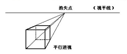
視差效果是使用3D變換,在Z軸方向位移一個元素,所以這種方法有一個副作用——他的有效大小隨著我們移動時其距離視口的遠近而改變。為了應對這個問題,我們需要對該元素應用scale變換,以使得其能夠按照原始大小渲染。
Since the parallax effect is created using 3D transforms, translating an element along the Z axis has a side effect – its effective size changes as we move it closer to or farther away from the viewport. To counter this we need to apply a scale() transform to the element so that it appears to be rendered at its original size:
譯者註:
在上面的 DemoOne 中,我們可以看到,第一屏的大小已經遠遠小於第二屏的大小。
原因就因為存在透視,我們從小就知道一個原理:近大遠小。
1 2 3 | .parallax__layer--back { transform: translateZ(-1px) scale(2); } |
縮放的大小可以根據:1+(translateZ * -1)/perspective計算。比如,如果我們的視口perspective被設置為1px,並且我們在Z軸方向位移元素-2px,那麼,正確的縮放比例應該是3.
The scale factor can be calculated with 1 + (translateZ * -1) / perspective. For example, if our viewport perspective is set to 1px and we translate an element -2px along the Z axis the correction scale factor would be 3:
1 2 3 | .parallax__layer--deep { transform: translateZ(-2px) scale(3); } |
See the Pen 純CSS視差滾動-深度校正 by Jimmy_Wu (@Jimmy_Wu) on CodePen.light
三、控制速度 / Controlling layer speed
層速度可以通過 perspective 和 Z 軸 translate 值的組合控制。 translate 為負值的元素要比正值的滾動速度慢。距離 值越遠,滾動效果越明顯。比如, translateZ(-10px) 的滾動速度要比 translateZ(-1px) 的慢。
Layer speed is controlled by a combination of the perspective and the Z translation values. Elements with negative Z values will scroll slower than those with a positive value. The further the value is from the more pronounced the parallax effect (i.e. translateZ(-10px) will scroll slower than translateZ(-1px)).
譯者註:
遠離透視點的物體運動慢的的原因還是因為透視導致的視覺上的差別。比如,從遠方以恆定速度向你駛來的汽車,你會覺的他的速度越來越快。同樣,觀察天空的飛機覺的他移動的很慢,但實際飛機分時速卻快的驚人。
四、視差區域 / Parallax sections
例子通過使用非常簡單的內容演示了視差滾動的基本方法。但是,大多數,視差網站把網頁分成不同的部分,使得每一部分可以應用不同的效果。下面演示這麼做到。
The previous examples demonstrated the basic techniques using very simple content but most parallax sites break the page into distinct sections where different effects can be applied. Here’s how to do that.
首先,我們需要一個 parallax__group 元素使我們的層組合在一起。
Firstly, we need a parallax__group element to group our layers together:
1 2 3 4 5 6 7 8 9 10 11 12 13 | <div class="parallax"> <div class="parallax__group"> <div class="parallax__layer parallax__layer--back"> ... </div> <div class="parallax__layer parallax__layer--base"> ... </div> </div> <div class="parallax__group"> ... </div> </div> |
這是組合元素的CSS樣式:
Here’s the CSS for the group element:
1 2 3 4 5 | .parallax__group { position: relative; height: 100vh; transform-style: preserve-3d; } |
在這個例子中,我希望每一個分組充滿整個視口,所以,我設置 height: 100vh,然而,如果需要的話,任意數值都可以設置給每一個分組。 transform-style: preserve-3d 阻止瀏覽器壓扁了 parallax__layer 元素, position: relative 使得子元素 parallax__layer 元素能夠相對於分組元素定位。
分組元素時必須記住的一條非常重要的規則是,我們不能夠裁剪分組內容。在一個 parallax__group 上設置 overflow: hidden 會破壞視差效果。未剪短的內容會導致後代元素溢出,所以我們需要創造性的使用分組的z-index值以確保用戶滾動文檔是正確的顯示/隱藏內容。
因為設計的不同,對於處理分層並沒有硬性規定。如果你能看到視差滾動效果,處理分層問題將會更加簡單。你可以像下面那樣給分組元素通過應用簡單的變換:
In this example, I want each group to fill the viewport so I’ve set height: 100vh, however arbitrary values can be set for each group if required. transform-style: preserve-3d prevents the browser flattening the parallax__layer elements and position: relative is used to allow the child parallax__layer elements to be positioned relative to the group element.
One important rule to keep in mind when grouping elements is, we cannot clip the content of a group. Setting overflow: hidden on a parallax__group will break the parallax effect. Unclipped content will result in descendant elements overflowing, so we need to be creative with the z-index values of the groups to ensure content is correctly revealed/hidden as the visitor scrolls through the document.
There are no hard and fast rules for dealing with layering as implementations will differ between designs. It’s much easier to debug layering issues if you can see how the parallax effect works – you can do that by applying simple transform to the group elements:
1 2 3 | .parallax__group { transform: translate3d(700px, 0, -800px) rotateY(30deg); } |
控制速度-看看下面的例子-注意調試選項!
Have a look at the following example – note the debug option!
See the Pen 純CSS視差滾動-視差區域 by Jimmy_Wu (@Jimmy_Wu) on CodePen.light
Browser support
Firefox, Safari, Opera and Chrome all support this effect.
Firefox works too but there is currently a minor issue with alignment.
IE doesn’t support preserve-3d yet (it’s coming) so the parallax effect won’t work. That’s ok though, you should still design your content to work without the parallax effect – You know, progressive enhancement and all that!
更新 / Update: 25 Feb 2015
Since writing this article it’s become apparent that webkit based browsers don’t correctly calculate the effective width of an element once transformed into 3D space and scaled up. This bug allows users to scroll content horiziontally ignoring any constraits defined with overflow property. It is possible to work around for this bug by anchoring the transform-origin and perspective-origin to the right hand side of the viewport:
給予 webkit 內核的瀏覽器,很明顯一旦轉換成 3D 空間並且放大的話,就不能夠正確的計算有效元素寬度。這個 bug 允許用戶忽視任何overflow定義的限制在水平方向上滾動內容。可以通過把 transform-origin 和 perspective-origin 設定到右邊視口解決這個問題。
1 2 3 4 5 6 | .parallax { perspective-origin-x: 100%; } .parallax__layer { transform-origin-x: 100%; } |
Locking the perspective and transform origins in this way causes any content overflow to occur off the left side of the screen. Since it’s not possible to scroll to a negative position the overflow issue is masked.
以這種方式鎖定視角和轉換源點引起屏幕的左邊任何內容溢出。因為它不可能滾動到負的位置,溢出問題的就此解決。
See the Pen 純CSS視差滾動-視差區域-BugFix by Jimmy_Wu (@Jimmy_Wu) on CodePen.light
Comments are closed.