
1 2 3 4 5 6 7 8 9 10 11 12 13 14 15 16 17 18 19 20 21 22 23 24 25 26 27 28 29 30 31 32 33 34 35 36 37 38 39 40 41 42 43 44 45 46 47 48 49 | body { margin: 55px 5%; } .s1, .s2, .mix { margin-bottom: 20px ; p { margin-bottom: 3px; font-size: 120%; } } .mix { a { padding:5px 10px; width: 100%; display:inline-block; text-decoration:none; color:#333;} .btn-group { label.btn { font-size:15px; background: #eee; min-width:120px; /* 保護彈出框不因為太小而整個區塊變小 */ margin: 0px 0px 5px; font-size: 16px; padding: 0px; float:none; &.focus, &:focus, &:hover { color:#333; /* 彈出框內文字樣式,不加會變白字 */ } } /*/label.btn*/ label.active { a { background: #333; color:#fff; /* 原本因為字白色加入字色彩 */ border: none; } } /*/label.active*/ & > .btn:first-child:not(:last-child):not(.dropdown-toggle), & > .btn:last-child:not(:first-child), & > .btn:not(:first-child):not(:last-child):not(.dropdown-toggle){ border-radius: 0px; border: 1px #333 solid; /* a標籤感應區塊,泛圍設為最外圍 */ } .popover:focus, .in:focus, .focus:focus, label.btn { outline: 0px; /*fix popover感應區外框線*/ } } /*/.btn-group > .btn-group*/ } /*/.mix*/ |
備註
– .popover .fade .in就算加了 z-index: 999;點按彈出框後滑鼠滑入另外的按鈕還是會使得按鈕壓在彈出框上面。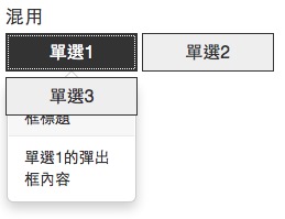
– .popover 感應區外框線 .popover:focus .in:focus .focus:focus label.btn 使用 outline: 0px;
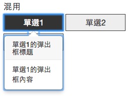
– 手機裝置一定要使用 tabindex="0" 與 role="button" ,不然點按時會沒有作用。Bootstrap 點擊並讓彈出框消失說明